For my Capstone Project, I used my rhetorical skills to analyze Goodreads' iOS app with the goal of improving its interface.
In the summer of 2023, I took ENGL 3120: Digital Writing and Publishing with Dr. Gu, where we completed a project analyzing a “bad” website of our choice to determine areas for improvement. This project sparked my curiosity in examining digital interfaces and laid the groundwork for my current study.
Drawing on insights from my coursework in rhetoric, along with technical design skills in UX/UI and Figma that I've developed independently, I have approached Goodreads’ app with a critical eye. My goal is to apply my combined skills to recommend enhancements to its usability and design.
Introduction to Goodreads
Goodreads is a social media app meant for readers to track books; they can add books to “want-to-read” or their own custom lists, as well as rate and post reviews of books they have finished. The 2020 pandemic fueled the rise of logging apps like Goodreads, as more people stayed indoors and consumed media. From 2011 to 2019, registered Goodreads users rose from five million to nine million, and from 2019 to 2023, that number has risen to 150 million (Blog Post).
Originally launched in 2007, it was initially created by programmer Otis Chandler for readers to receive book recommendations based on their ratings for other books. Goodreads was acquired by Amazon in March of 2013 to mixed reactions, with the Authors’ Guild saying “Amazon's control of online bookselling approaches the insurmountable" (The Guardian). However, since its purchase over a decade ago, Goodreads has yet to see any significant overhaul, as its interface has remained the same. Given that this app is owned by one of the biggest companies in the world, it’s strange to think that it still has its same clunky and outdated design; however, this may be its very reason for its lack of an update, as it is under Amazon, there is no financial way that Goodreads would ever fail (Study Breaks Magazine).
Initial Research
I started my research journey by looking through App Store and article reviews for Goodreads.
Many of the reviews mention how the app lacks visual appeal, saying that it looks “old.” Reviewers also note that profiles are lackluster, and the feed layout only shows recommendations and ads. These reviews show that Goodreads needs an updated interface to keep up with other book-tracking apps.
Many of the reviews mention how the app lacks visual appeal, saying that it looks “old.” Reviewer Macy Zimmerman also writes that profiles are lackluster, and the feed layout only shows recommendations and ads, displaying a need for an updated design.
Home Feed
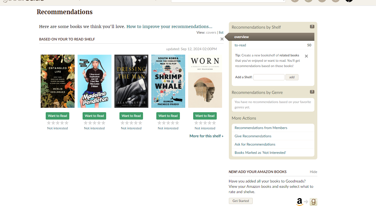
In the home feed, users will receive updates on any new trending books based on genres that they have favorited. It also provides recommendations based on books you’ve favorited and liked recently.
The home feed will also provide updates on their friends’ activity such as reading progress, whenever they add new books to their bookshelves, and whenever they like any sort of review. Noah Keate writes, “The prime flaw, in my view, is the eternal spam of irrelevant content. Whenever the app is opened, over 50 new notifications will be there… I think Goodreads is used less as a social media hub but more for an individual purpose. In this sense, Goodreads has failed its number one mission to unite readers and create discussion,” suggesting there is a need for updates such as “Friend wants to read,” “Friend is 72% done with.” The only updates from friends needed are posts that are meant to spark discussion, whether it’s a rating for a book they’ve finished, or if they want to post a status update for a book not yet completed. I also find that there are not enough distinguishing visual elements between the “Read,” “Want to Read,” and “Reading” buttons. The only differing element is the color of the checkmark, while the buttons, if the books are already added on a user’s shelf, are the same beige color.
My Books
For the user’s personal books, Goodreads provides the shelves “Currently Reading,” “Want to Read,” and “Read,” which all display a small image collage of the most recently added books, creating a customized and engaging experience. However, custom shelves created by users lack this consistency and are displayed as simple text buttons, which diminishes their visual appeal and disrupts the design uniformity.
Discover/Search Pages
In the discovery page, users are able to browse books based on their recent likes or what’s popular. On the top page, there will be a feature article—in this case, “64 Reading Recommendations for Every Fall Reading Vibe.” Users can also click to find a link to a page with all recent articles or interviews.
Despite having their own blog forum, it’s difficult to navigate to, as users must click through multiple links to find it. Furthermore, this is nothing on the Discover page indicating that it’s a clickable link.
The “Discover” and “Search” pages also have similar functions, which is to give recommendations to users based on their past reading activity or favorite genres. The Search page is redundant and unnecessary, given that the search bar provided also appears as a header. While the rest of the app properly utilizes white space for organization, the vast space on the “Search” page makes the page feel empty and incomplete.
Lists
As you scroll to the bottom of the Discover page, you can find lists that are not catered by the Goodreads algorithm. Instead, they are curated lists created by Goodreads editors and members. Users are able to browse lists by category or genres, and after pressing on a link, users are shown the books in the list, as well as tags that are applicable to the list. For example, the list “Best Books Ever” has the tags “Best,” “Favourites,” “Favorites,” etc.
When clicking on the tags, it will take you to a page that looks similar to the browsing page with more lists on it. While this may make sense to help users find lists, the tag system is quite confusing, as users are not able to look up specific tags; they would instead have to navigate through the different lists with similar tags.
Profile
For users to access their profile page, they must press the three lines on the bottom right footer menu, then click on their profile picture. After pressing the three lines, however, users can access other menus, such as another link to recommendations, friends and groups, another search function, and settings. Instead, having the user’s profile accessible directly from the footer would make it quicker to access. Similarly, much of the information provided is redundant; labeling this page as “more” insinuates that there are features not accessible anywhere else in the app.
In the user's bookshelf section, custom bookshelves are typed out without any sort of visualization. To look through a user's bookshelves, they would swipe horizontally for "Currently Reading," "Want to Read," and "Recently Read," showing a lack of visual organization on the user's profile.
After analyzing these features, I created a lofi prototype with new designs implemented, seen below. The home button, My books button, Discover button, and profile button are all clickable, and all pages are scrollable.
Edits: Home Feed
For the home feed, instead of seeing trending books, users will only see updates from their friends. Articles and blog posts were also moved from the Discover page to the home feed so that users can access a more personalized and diverse range of content directly on their main interface, reducing the need for navigation to multiple sections.
The update posts also improved their visual appeal by changing the buttons from their original beige color to a set of color-coded options. This decision was motivated by the need for greater contrast and visual hierarchy within the posts to capture the user’s attention. Beige buttons tended to blend into the background, making them ineffective in guiding user interaction.
Colored buttons not only enhance contrast but also serve to highlight the most visually striking elements of each update post: the book cover, the button, and the user's profile picture. These three components work together to create a balanced and engaging visual design. The book cover draws users into the content, the profile picture establishes a personal connection, and the color-coded button provides a clear call to action, such as adding a new book to your shelf. This visual hierarchy simplifies the user experience by directing attention naturally to the key elements in order of importance.
Additionally, color-coding buttons can improve usability by providing intuitive cues about their function. For instance, associating specific colors with particular actions—such as green for positive actions like marking a book as "Want to Read" or red for a delete option—allows users to understand their purpose at a glance. This reduces cognitive load and makes interactions more efficient. By making these changes, the update posts are now more visually engaging and aligned with modern design principles that prioritize clarity and accessibility.
Edits: My Books
To create a cohesive interface, I redesigned custom shelves to match the default style for a more consistent look, including book preview images for quick detail viewing without leaving the page.
Visual consistency is a critical aspect of effective interface design as it establishes a sense of familiarity and trust for users. When different elements of a platform, such as default and custom shelves, share a unified design language, users can navigate more intuitively, reducing cognitive load and potential confusion. By ensuring that custom shelves resemble default ones in style, users are less likely to feel disoriented or perceive the platform as fragmented. Instead, they can focus on their primary tasks, such as organizing books, without unnecessary distractions.
Edits: Discover
I combined the “Discover” and “Search” tabs to reduce redundancy; by merging these two sections, I eliminated unnecessary overlap and created a single, more efficient space for users to explore new books. The overall design was kept similar with the exception of an added search bar on the featured lists page. This allows users to navigate the various lists more effectively by directly searching for a specific list rather than relying solely on tags, which can be less intuitive. This change can enhance the browsing experience by giving users more control in finding content that matches their interests.
In addition to these updates, I moved articles and updates from authors—previously found in the “Discover” page—to the “Home” page. This adjustment allows users to access relevant updates and articles in one primary location instead of having to navigate between multiple tabs.
Introducing a search bar for featured lists supports content discovery, allowing users to find what they need quickly without being limited to preset tags. Moving articles and updates to the home feed further reinforces the idea of a centralized hub for all relevant information, promoting a more seamless browsing experience and improving the app’s overall content organization and layout.
Edits: Profile
Previously, the categories “Currently Reading,” “ Recently Read,” and “Want to Read” were displayed on a single line that required users to swipe through to view each section. Separating these categories into three distinct lines ensures that all information is visible at a glance; this way, visitors can immediately see a user’s latest reviews or completed books without needing to navigate elsewhere. This not only highlights recent activity but also provides a better overview of the user’s current engagement with books.
To further enhance personalization and visual appeal, I introduced a “Favorites” category at the top of the page. This feature allows users to display their top four favorite books prominently, inspired by the app Letterboxd, which uses a similar approach for showcasing favorite films. The addition of this section encourages users to share a curated glimpse of their literary tastes directly on their profile pages.
The primary goals were improved content organization and design consistency. Separating the reading categories into distinct lines aligns with the same organizational principles applied to the custom bookshelves and the Discover page. It creates a cleaner, more structured interface, making it easier for users to navigate and understand at a glance. Similarly, the “Favorites” feature aligns with modern design trends that emphasize personalization and quick access to meaningful content.
CTC Reflection
The rhetorical context of my project involves analyzing and redesigning the Goodreads iOS app to enhance its usability. I chose this topic for my project as an avid Goodreads user who has many critical opinions on the app itself. My primary audiences are future employers and graduate school admissions committees. By documenting and displaying my understanding of the necessity of good design, I aim to showcase my technical skills, and ability to solve real-world problems, which will benefit me in both the workplace and academic settings.
This assignment mimics workplace responsibilities like analyzing user complaints, identifying pain points in existing designs, and creating solutions to improve the overall design. Tasks such as creating wireframes in Figma and justifying my design choices helped me practice technical skills within Figma, as well as my argumentative skills developed in my Rhetoric pathway. A large portion of my project was writing a persuasive case for the necessity of design changes and properly presenting my ideas via my website, so being able to revisit rhetorical concepts from previous semesters was insightful for me. With this project, I was able to utilize tools like Figma to create polished prototypes and approach a design problem with a user-centered perspective, allowing me to balance creativity with practicality. I was also able to communicate my thought process clearly and persuasively.
I need to improve my proficiency with advanced settings and techniques in Figma, such as creating interactive prototypes. I also wish I had the resources and time to conduct a user research phase. After getting my project reviewed by a professional in the UX/UI field, she helped me realize that most case studies are visual based, and that the amount of writing I had may be too much for an actual case study for job interviews. However, for the purpose of this project, I decided to keep the amount of writing because instead of the visual changes and design process, I wanted to display my understanding of visual rhetoric that I’ve learned throughout my time at the University. However, I realized that I may not have had a total understanding on how actual professionals may write case studies, so having someone outside of academics look over my project benefited me, even if I didn’t make these changes directly in my project.
Assignments that involve conducting usability tests with real users and analyzing the results would help me better understand user behavior and preferences. Additionally, collaborative projects where I work with developers or other designers would build my teamwork and communication skills. Finally, being able to physically present my findings would further prepare me for industry expectations.
