Case Study
PageCount
A research-driven iOS reading tracker designed for reflection, not performance.
The challenge
The problem
Many avid readers track their reading digitally, but existing tools prioritize social features and reviews over personal insight. Current apps make it difficult to understand reading patterns at a glance, track progress meaningfully across formats, and reflect on habits beyond simple book counts. Busy adults who read across paperback, ebook, and audiobook formats are especially underserved by tools that assume consistent reading conditions and low cognitive overhead.
The Current Landscape
Social and review-driven features dominate the market, leaving personal reflection and edition flexibility largely unsupported. Goodreads, StoryGraph, and LibraryThing each address parts of this need but none center on the low-effort, reflective experience that readers across formats actually want.
The question
How might we support reflective, low-effort reading tracking while enabling inclusive and socially supportive experiences across formats? Any solution must also consider the risks of reintroducing the pressure it aims to remove; gamification features like streaks, public progress, and social comparisons can quietly undermine a design built around personal reflection if not handled carefully.
Research: Competitive Analysis
What the market already does
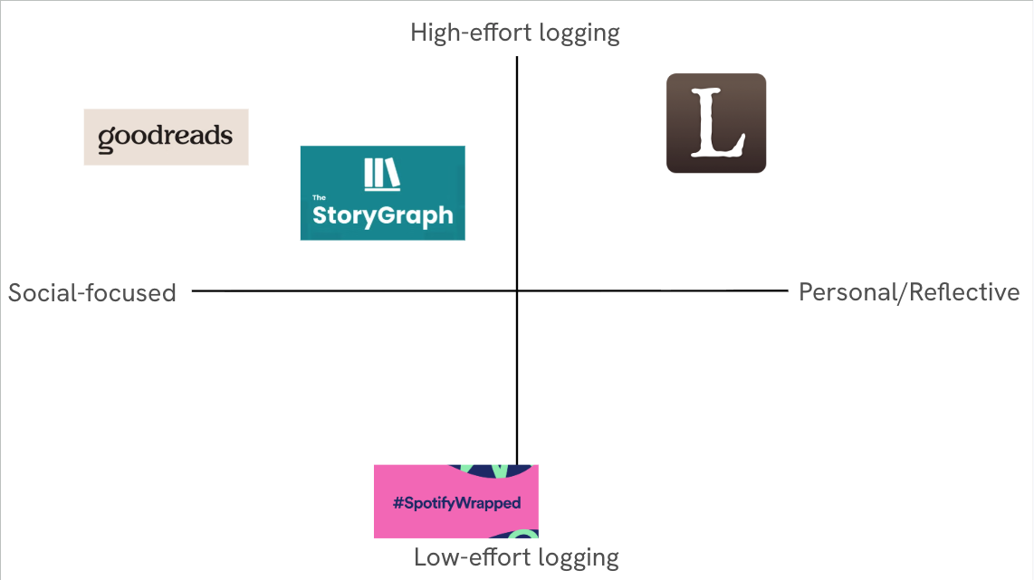
Four competitors were evaluated: Goodreads and StoryGraph as direct competitors, LibraryThing as an indirect competitor, and Spotify Wrapped as an analogous reference for data visualization done well. Each was assessed against five design criteria: edition-flexible tracking, meaningful visualization, low-friction logging, personal insight over social comparison, and transparency of data.
Where every app leaves room
Goodreads offers the largest book database and familiar social features, but its data visualization is limited and opaque, and edition changes often reset progress. StoryGraph improves on statistics but relies on predefined visualizations that can overwhelm users. LibraryThing offers rich bibliographic metadata but prioritizes data entry over insight. None of the direct competitors make reading data feel rewarding rather than administrative.
What this told me to prioritize
Spotify Wrapped offered the clearest model for what reading data could feel like: progressive disclosure of insights, visual-first summaries, and an emphasis on personal reflection over comparison. This analysis clarified that the design opportunity lay in how data is presented, not how much is collected — a principle that shaped every subsequent design decision.
Research: Interviews
Who I talked to
Two semi-structured interviews were conducted with readers across different usage patterns and life stages. The first participant was a full-time student who reads occasionally in ebook and audiobook formats, primarily discovering books through BookTok. The second was a recent graduate working in tech who reads regularly across physical books, audiobooks, and ebooks, fitting reading into a busy schedule rather than treating it as a productivity task.
What they told me
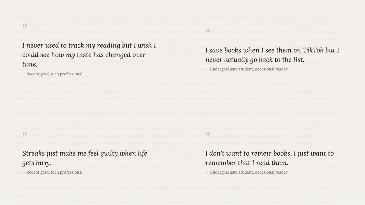
Both participants described logging as something that felt motivating in theory but effortful in practice. The student used reading apps mainly as a "want to read" list rather than a progress tracker, motivated by social media recommendations rather than personal goals. The professional valued tracking for noticing how their tastes evolved over time, but felt discouraged by comparison-heavy features like streaks and public goals.
Interview coding
Transcripts were independently coded for recurring themes and then consolidated into four patterns: frustration with high-effort logging, discomfort with performative social features, interest in personal reflection over comparison, and desire for format flexibility without manual workarounds. These four themes directly informed the persona development and design requirements that followed.
Synthesis: Personas & Scenarios
click a persona to bring it forward
Scenario 1
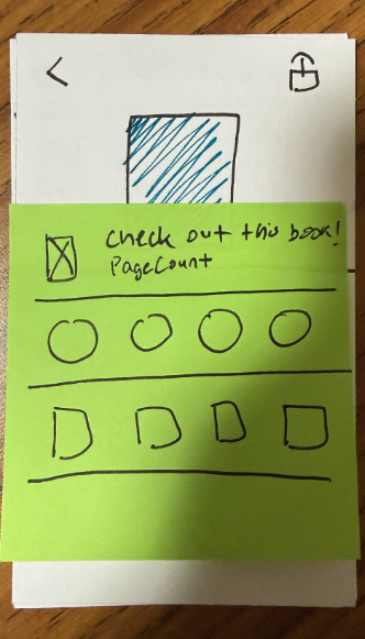
Maya discovers a book recommendation on TikTok that connects to a current class project. Using PageCount's quick-save feature, she adds it to her Want to Read list in seconds — tagged under "Design" and "School" — without any pressure to commit to reading it immediately. Weeks later, when her schedule lightens up, she filters by tag and rediscovers the book, starting it that night.
Scenario 2
After finishing an audiobook during his commute, Alex logs it as complete in under a minute — adjusting the dates retroactively and adding a short note about how it helped him focus during a busy work month. Later that weekend, he browses the insights tab and notices that his audiobook listening consistently increases during heavier work periods, appreciating that the visualization describes his habits without pressuring him to read more.
Coding to patterns
Interview codes were clustered into behavioral archetypes grounded in observed tendencies rather than assumptions. Two distinct user types emerged: one oriented toward low-effort organization with no interest in analytics, and one oriented toward reflective tracking with strong aversion to social pressure. These patterns shaped every subsequent design decision, from navigation structure to which features were made optional versus central.
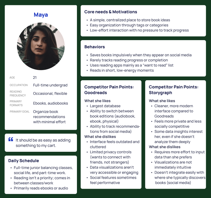
Maya
Maya is a 21-year-old undergraduate student who reads occasionally in ebook and audiobook formats. She saves books impulsively when they appear on social media and rarely tracks progress or completion. She wants a simple, centralized place to store book ideas with minimal interaction required. In Goodreads, she dislikes the outdated interface and performative social features; in StoryGraph, she finds the data input requirements higher than she prefers.
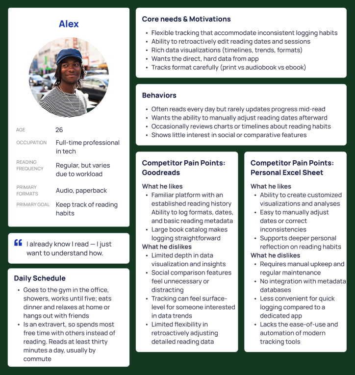
Alex
Alex is a 26-year-old tech professional who reads regularly but variably depending on workload, primarily in audiobook and ebook formats. He values tracking for personal insight — noticing how his tastes evolve — rather than for goals or accountability. He finds streaks and public progress discouraging rather than motivating. Both Goodreads and StoryGraph offer features he finds useful, but neither centers the reflective, low-pressure experience he actually wants.
Design Process: Mapping & Early Prototyping
User flows
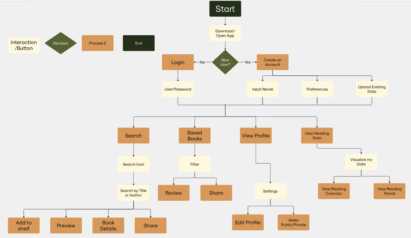
Before drawing any screens, core user paths were mapped: adding a book, logging a reading session, and navigating to stats. This process surfaced early structural decisions — particularly around the bottom navigation bar — and identified where friction was most likely to occur. Mapping flows first prevented the common trap of designing individual screens in isolation before understanding how users move between them.
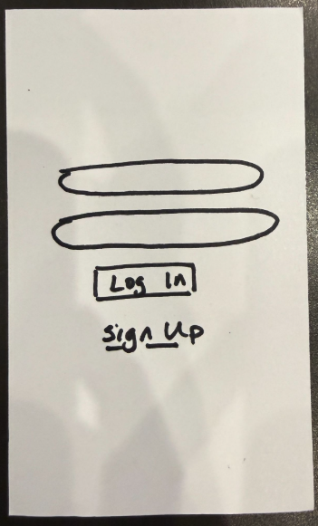
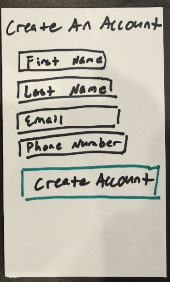
Paper prototype
The flows were translated into lo-fi screens covering onboarding, bookshelf organization, and progress logging. The paper prototype kept visual decisions deliberately rough so that feedback could focus on structure and interaction rather than aesthetics. Eight screens were developed, covering the primary task flows identified during the mapping phase and establishing the basic information architecture before any digital tools were introduced.
Feedback & pivots
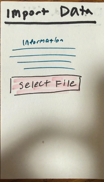
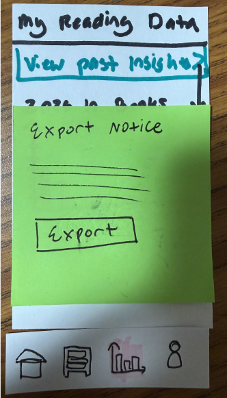
Critique of the paper prototype surfaced two key issues: the app's main purpose wasn't immediately legible to new users, and the navigation bar created a repetitive feel that undercut the sense of moving through a coherent experience. Positive feedback centered on the customizable shelf organization and the encouraging tone of the interface copy. Both findings directly shaped the wireframe structure — particularly the home screen hierarchy. Several features present in the paper prototype were intentionally scoped out of the final prototype. Real-time AI-powered stats visualization was the most significant omission. The technical complexity of implementing this fell outside the scope of a course prototype, but it remains the feature with the most potential to deepen the reflective experience PageCount is designed around. The CSV import and export feature was also flagged during feedback as potentially working against the reflective goal: downloading raw data suggests quantification rather than meaning-making, and in a future iteration this feature would be reframed around insight export rather than data export.
Design Process: Wireframes → Low-fidelity → Hi-fidelity
Wireframes
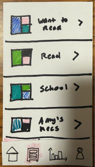
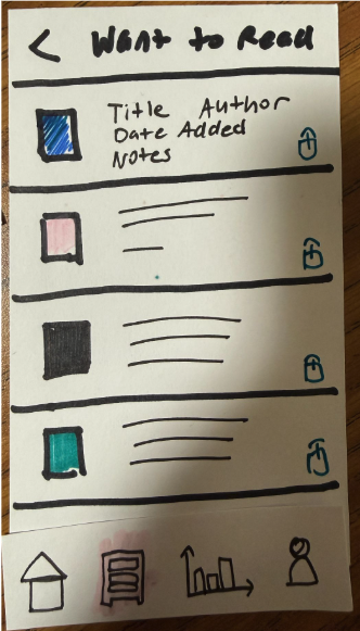
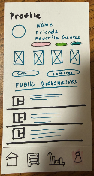
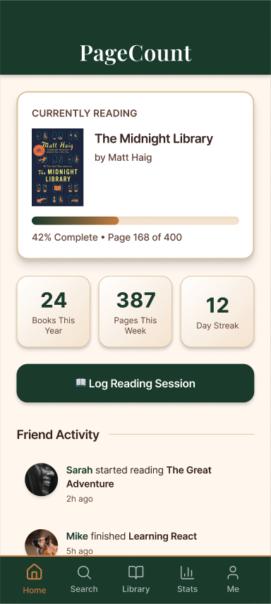
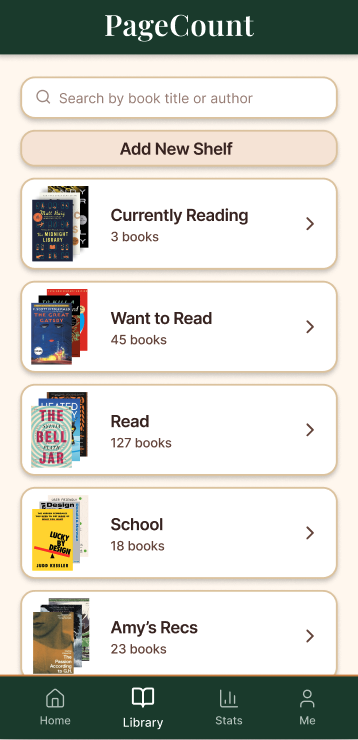
Ten annotated screens refined the interaction model before any visual treatment was applied. The home screen was restructured to lead with the current read and key stats, making the app's purpose legible at a glance. The library tab introduced named shelves — Want to Read, Read, School — with individual privacy toggles per book. A friend activity feed was positioned below the primary content to keep the social layer visible without requiring navigation away from the main view.
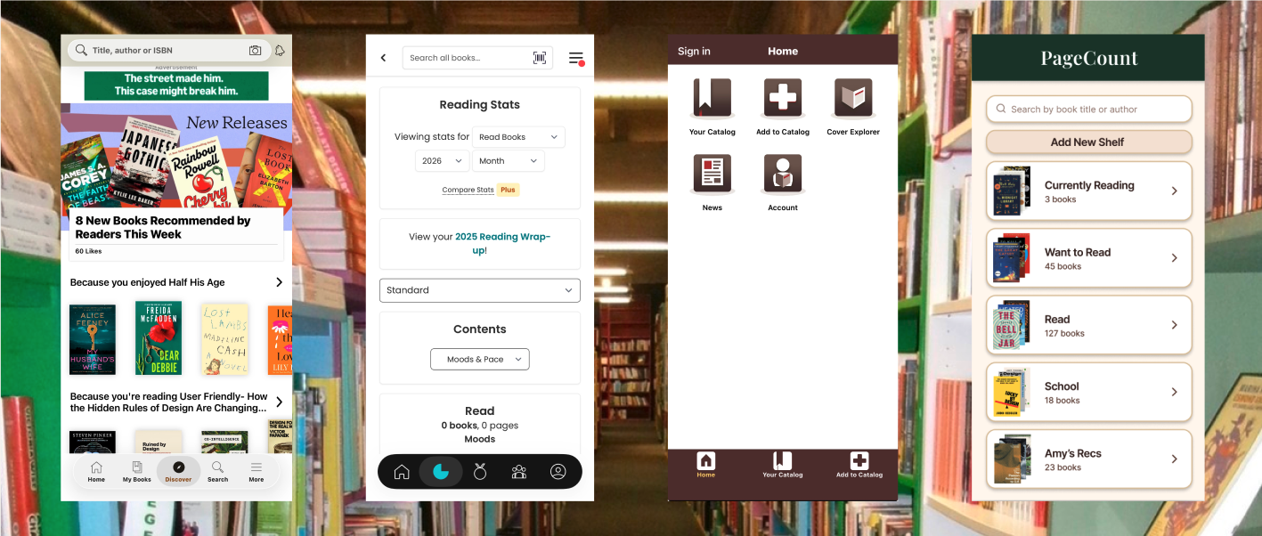
Hi-fidelity prototype
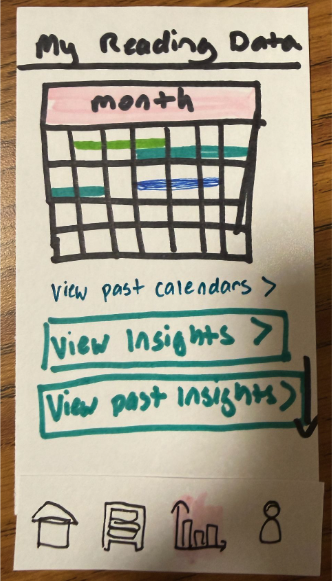
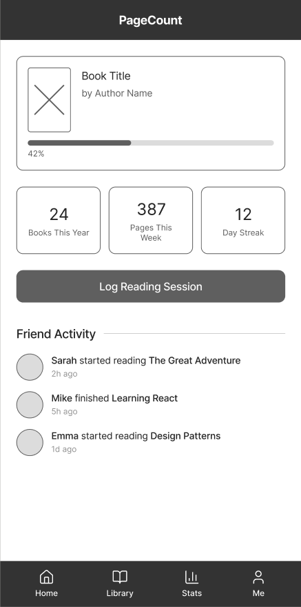
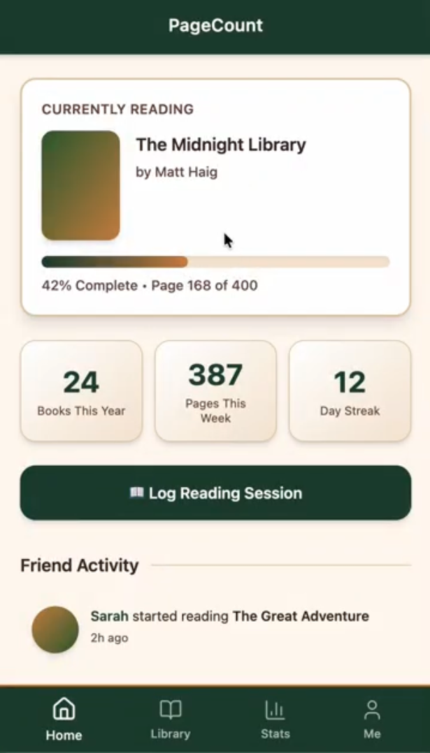
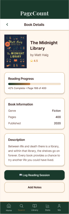
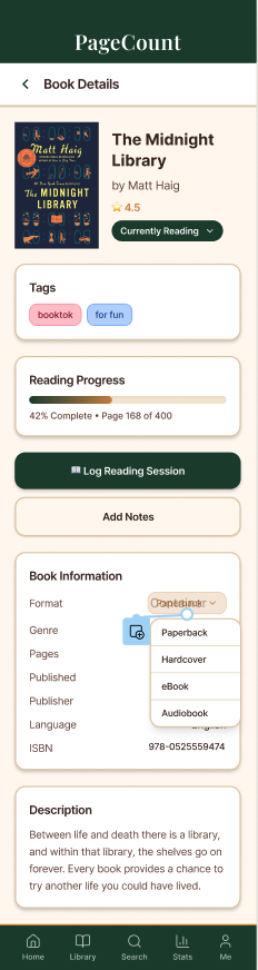
PageCount was built out in Figma with a warm terracotta visual language intended to feel personal and distinct from the clinical interfaces of Goodreads and StoryGraph. Key screens include the home dashboard, the library with shelf organization, a stats tab with a reading calendar, and a profile page with genre tags and action buttons. The visual system aimed for cohesion across all four tabs while keeping the interaction model familiar enough to require no onboarding friction.
Remaining iterations
Three areas were flagged for the next round of iteration. First, book cover placeholders all pull from the same terracotta color family, making a full library feel undifferentiated. Second, the stats calendar uses color-coded horizontal lines that do significant visual work without a legend to explain them. Third, the profile page grid of book covers sits between genre tags and action buttons without a label or tap destination, making it feel orphaned from the rest of the information architecture.
Usability Testing and Iteration
What we tested
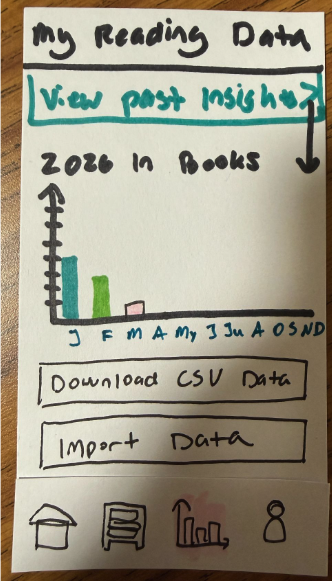
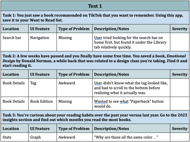
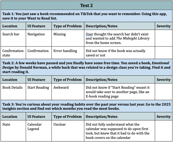
Two usability tests were conducted on the PageCount hi-fi prototype, each covering three tasks: saving a book discovered on TikTok to the Want to Read list, finding a previously saved book and starting to read it, and exploring the 2025 insights section to identify reading patterns by month. Participants included one avid reader familiar with reading tracking apps and one occasional reader with general technical literacy but no prior experience with this type of app.
Key friction points identified
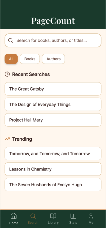
Search bar: both participants looked for it on Home first
and couldn't find it
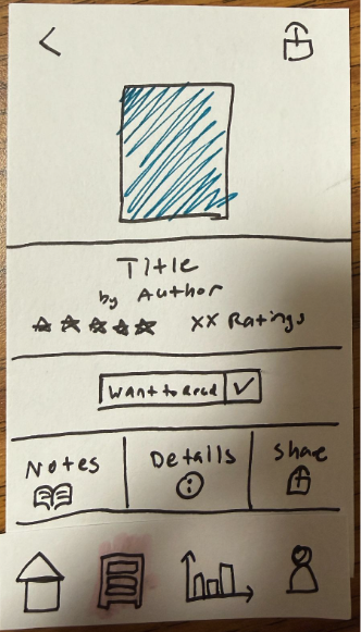
Confirmation state: neither participant was sure the book had actually saved
Tags: not visible without scrolling, missed entirely by one participant
"Start Reading" button: unclear whether it would open an in-app or external reader
Stats calendar: color coding uninterpretable without a legend
What changed as a result
Based on these findings, five issues were prioritized for the next iteration: adding a search bar to the main navigation, moving tags higher on the book detail page so they are visible without scrolling, adding a confirmation state when books are saved to the library, and moving the reading status closer to the top of the book detail page. The search bar addition was the most significant structural change — and notably, it did not emerge until after usability testing, which aligns with findings from "Low vs. High-Fidelity Prototyping Debate" (Rudd, Stern & Isensee, 1996): low-fidelity testing surfaces navigation assumptions that designers overlook when working within a single screen at a time. Peer feedback from the in-class demo also identified two areas for further refinement: inconsistent PageCount header sizing across screens, and low contrast on active navigation bar states — both of which will be addressed in the next design sprint.
Final Design
Reflection
Design Flow
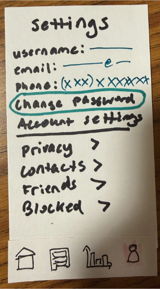
PageCount is organized around four tabs that users can navigate in any order: Home, Library, Stats, and Me. Home surfaces the currently reading book, key stats, and a friend activity feed. Library gives access to named shelves — Want to Read, Currently Reading, Read, School, and Amy's Recs — each with individual privacy toggles so users can control what is public versus personal. Stats houses the reading calendar, insights, and data visualization. Me contains the user profile, settings, and social connections. The design intentionally avoids a prescribed reading journey — users move through the app according to their own habits rather than a guided flow, which supports the low-pressure, reflective experience the app is built around.
Something worth Highlighting: AI-assisted Stats Visualization
The feature I'm most excited about is one that doesn't fully exist yet: AI-assisted stats visualization. Having worked with SQL and relational data, I'm drawn to the idea of surfacing personalized reading insights — not just "you read 24 books" but "your reading pace slows in October, and you tend to finish books faster when they're under 300 pages." Language models could make that kind of analysis accessible without requiring users to write queries. The prototype gestures toward this with the genre color legend and the insights tab, but the full potential of this direction is still ahead.
Something else worth Highlighting: Privacy
The second is the privacy model. Every shelf in PageCount can be toggled between public and private, and the social layer — friend activity, public bookshelves — is opt-in rather than default. This was a direct response to what both interview participants described: a discomfort with performative reading and social comparison. Making privacy a per-shelf decision rather than a global setting gives users fine-grained control over what their reading means to others versus what it means to them.
On the name "PageCount"
The name implies quantification — tracking pages, measuring progress — which sits in some tension with the reflective, low-pressure goal the app is designed around. In hindsight, the name emerged early in the process before the core concept fully sharpened, and it carried forward by inertia. A name that centers memory, habit, or personal meaning would be more aligned with what PageCount actually tries to do. This is the kind of thing that's easy to overlook when you're deep in the design work, and the feedback is a useful reminder that naming is a design decision too.
Tools and Approaches
Three tools were most critical to this project. Figma Make provided a starting point for the hi-fi prototype — it generated a usable baseline quickly, but the output required significant restructuring. Paper prototyping was the most generative phase of the process. Keeping visual decisions deliberately rough forced feedback to stay focused on structure and flow rather than aesthetics, which surfaced the navigation legibility issue early. Figma for hi-fi prototyping gave precise control over visual design and interaction flows, and the overlay and variant systems enabled realistic interactions without writing code.
Impact and Ethics
PageCount's potential impact is modest but specific: it could make reading feel more sustainable for people who have complicated relationships with tracking apps. By centering personal reflection over social performance, it removes one of the main reasons people abandon reading trackers — the guilt of falling behind a public streak or a friend's count. The ethical considerations are worth naming honestly. Any app that tracks behavior creates data, and reading data is personally revealing. PageCount's privacy model is designed with this in mind, but it would require careful data governance in a real product. There is also the question of whether "reflection" is measurable, and whether features like CSV export quietly reintroduce the quantification they're meant to resist.