Case Study · SI 622 · Needs Assessment and Usability Evaluation
City of Dearborn Usability Study
Community-engaged usability research on dearborn.gov — examining who the site serves, where it falls short, and what it would take to fix it.
The challenge
The partner
The City of Dearborn launched a redesigned website in August 2024, serving 110,000+ residents. However, usability gaps remain, and the city asked us to investigate how to improve the user experience.
The gap
Residents, city staff, and local businesses all have different needs on dearborn.gov, and the site wasn't built with real user feedback.
The question
How do residents of varying ages, abilities, and technical backgrounds experience dearborn.gov? Where does the site fall short?
Research: Interviews

Stakeholder interview
We met with the City of Dearborn communications team to understand the site's history — a 2024 migration from Joomla to Drupal — and align on scope. Stakeholders wanted prioritized, actionable recommendations that could be implemented within existing Drupal templates, without deep back-end changes.
Resident interviews
We conducted five semi-structured interviews with Dearborn residents recruited across age, physical ability, and technical experience — spanning a current student, a hearing-impaired frequent user, a retired librarian, a neighborhood association leader, and a substitute teacher. Sessions ran 30–45 minutes via Zoom or phone, with one interviewer and one note-taker per session.
Interview coding
Each team member independently coded their own transcript for recurring patterns, then we consolidated across interviews as a group. Codes were clustered into four key themes: mobile experience gaps, non-intuitive navigation, broken external links, and the site's underuse of Dearborn's community culture.
Research: Survey Design and Deployment
Research question
Building on five interviews, we needed a larger sample to validate patterns and surface usage trends across Dearborn's population. The central question: how do citizens interact with city resources — including residents who never visit dearborn.gov at all?
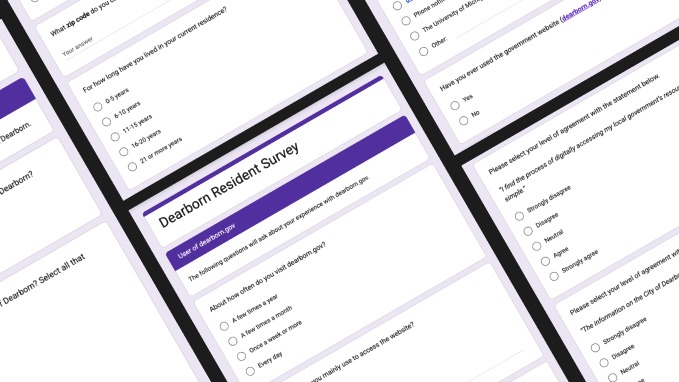
Instrument design
We pilot-tested a draft survey with three participants outside the project team, then revised based on their feedback — clarifying ambiguous wording, fixing branching logic between user and non-user paths, and adding questions about mobile app interest and demographic data.
Deployment
Physical QR code flyers were posted in and around Dearborn government buildings, with digital distribution through social media and the UMSI Slack community. We combined convenience and snowball sampling — the most realistic path to broad reach given no financial incentives and a population too large for targeted recruitment.
Synthesis: Personas and Scenarios
click a persona to bring it forward
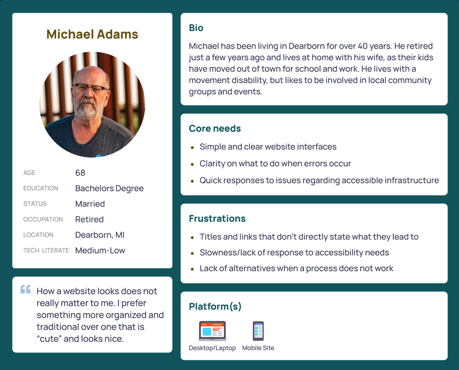
Scenario 1: Michael
Michael wants to watch a livestream of a meeting occurring with his local council members, watching from home to avoid difficulties with attending in-person. He uses his home computer to navigate to the website and finds the location where the livestream can be accessed. After clicking, he struggles to find the livestream and accidentally opens multiple past recordings that he has already seen. He quits the website in frustration and considers watching a recording later. On a different day of using the website, he encounters a "404 error", which confuses him even more. He wonders if he will need to go to events in-person, even though his condition would make it difficult.
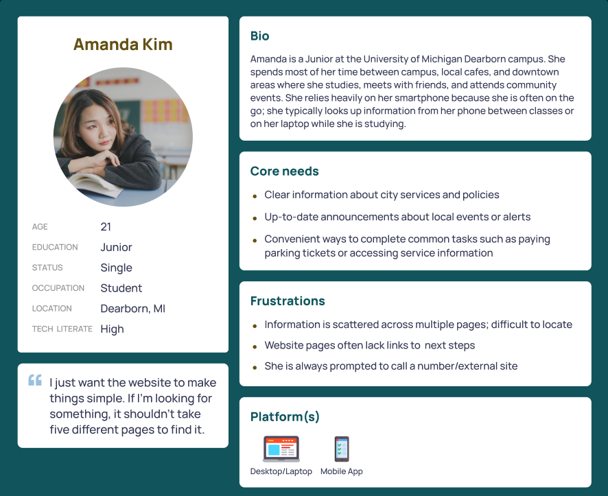
Scenario 2: Maya
Maya recently received a parking ticket while visiting a friend downtown. When she got home, she went to the city website to pay it online. While on the "Pay Parking Ticket" page, she began wondering what her options were if she wanted to dispute the ticket instead. However, the page only provided payment instructions and did not include information about contesting a ticket or attending court. To find this information, Maya had to return to the homepage and navigate to the Courts section of the website to locate the dispute process. The extra steps made the process confusing and frustrating, leaving her wishing the relevant information had been linked directly on the parking ticket page.
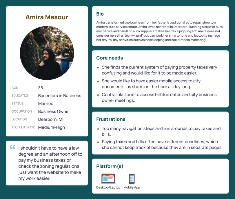
Scenario 3: Amira
Amira's store has become very busy with the new season. She wants to find out when the next City Council meeting is regarding small business grants and when she has to pay her quarterly taxes. Amira feels like she's being made to run-around by a website where she's forced to dig through links in various sub-pages to find meeting agendas and then go through more pages to find payment deadlines. She wishes for a simple system where she can easily see these dates in a calendar so she can see updates while being on the garage floor.
From codes to patterns
After each team member independently coded their interview transcript, we consolidated findings as a group — combining and grouping codes into cross-interview themes. Three consistent user archetypes emerged, distinguished by age, platform preference, and primary reason for visiting the site.
Three personas
Michael, a 68-year-old retired Dearborn resident with a movement disability, needs simple interfaces and clear error handling — he wants organization over aesthetics, and relies on the site to stay civically engaged from home. Amanda, a 21-year-old UM-Dearborn student, is highly mobile-dependent and frustrated by scattered information and dead-end pages that force her to start over. Amira, a 35-year-old local business owner, needs a centralized place to track bill deadlines and city meeting dates — right now the site makes paying taxes feel like a part-time job.
Scenarios
Each persona was paired with a realistic scenario drawn from their needs. Michael tries to watch a council meeting livestream from home, encounters a 404 error, and gives up — unsure if he'll ever be able to participate without attending in person. Amanda goes to pay a parking ticket and can't find dispute information on the same page, forcing her through multiple sections to complete a task that should be self-contained. Amira needs to find a small business grants meeting date and her quarterly tax deadline, but has to dig through separate sub-pages to find each — wishing for a single calendar that surfaces both.
Research: Comparative Analysis
Comparator selection
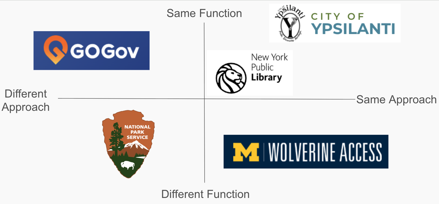
With no actual direct competitor to dearborn.gov, we mapped five categories: direct (City of Ypsilanti), partial (New York Public Library), indirect (GoGov civic app), parallel (Wolverine Access), and analogous (National Park Service). Each was chosen to surface a different class of design lesson.
Evaluation framework
We built a custom matrix across five dimensions — accessibility, information organization, contact, services, and vibe — evaluating each comparator against consistent criteria like mobile accessibility, navigation clarity, search function, and community highlights. Dearborn.gov held its own on several criteria, including multilingual support and community highlights, but was the only site to receive a partial mark on navigation clarity — flagging it as an area needing attention rather than an outright failure.
Key findings
Dearborn.gov meets baseline needs but lags on navigation clarity, mobile task flows, and community identity. Ypsilanti and the NPS showed stronger visual hierarchy. GoGov demonstrated streamlined high-frequency task flows. The NPS and NYPL showed what a richer, more dynamic community presence could look like.
Heuristic evaluation
Coming soon.
Usability testing
Coming soon.
Reflection
Coming soon.